
The Twin Cities River Monsters came into the league in 2029 as part of a 4 team expansion. Throughout the 33 years of the franchises history, the team has kept the original logo and uniforms. We feel that the current design is dated and needs a little freshen up. When going for a new look, we wanted to respect the teams history. We never once thought about moving the team, changing it's name ore even stray far from the look and feel that the team embodies. What we wanted to do is get rid of the redundant TWC on both the hat and uniform and bring the style into 2060 standards.
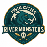
As you can see by the logo above, there are some drastic changes. We wanted a classic feel that was interesting and modern, yet familiar. The River Monster itself had to stay. He is iconic to the franchise. He is a little less cartoonish in the updated logo. To his left and right is the skyline of the Twin Cities. One side being Minneapolis and the other side being St. Paul. Underneath him is the team name "River Monsters" backed by a wavy texture to represent the violent waters in which a River Monster may be found. The criss crossed bats also embodies the "Twin Cities" as two entities meeting as one. The shape of the logo is a hybrid circle/crest design. Meant to look classic, but not boring. The biggest change may be the addition of gold to the color scheme. We wanted to add a subtle hint of class and gold seemed to mesh well with the green and dark blue.
This logo came together really quick and sparked this rebrand. When I started this projected I was targeting next season. Seeing how much I liked this logo really pushed me to get the rest done.

Without a doubt, the hat was the hardest part of this rebrand. And to be honest... While I do like this hat, I'm still not 100% satisfied it fits what I was going for. I wanted to stay true to the history of the franchise and make some kind of interlocking TWC logo. That is easier said than done. I must have tried 100 different designs. There was one that I did end up liking, which I'm sure will surface someday. But if was too futuristic and looked like a college football logo. I then went to try just TC. But literally every design I came up with just looked like a city connect Twins hat.
Finally I thought... well the Twins use TC instead of the logical M for Minnesota? What if I flipped that and used an M for Minnesota instead of a TC or TWC? I tried a few logos with the M and had some much better designs. I settled on the River Fin M. It's a stylized "M" shaped like a river monster fin breaking the surface. Side Patch: Circular Minneapolis skyline at sunset. Underbrim: River topography in teal

For the home uniform(as modeled by Doubleday Game 1 starter Jerry Stone), I really wanted to keep it pretty simple and similar to what we have now. So it's just a white jersey with green pinstripes. River Monsters go armpit to armpit in a simple blue and gold font. I included the players number on the front of the jersey to justify higher prices of custom jersey sales.

For the road uniform, I figured I'd do the sleeveless design. Why? Well why not? No reason really. Just to keep things interesting. Twin Cities is written in Green/Gold cursive(do people even use cursive in 2063?) with a brush stroke underneath. The uniform itself is grey with dark blue pinstripes. Having pinstripes on the road was important to me as anytime I think about Kirby Puckett, I get the mental picture of him in road pinstripes.Modeling this uniform is Raul Gallehos collecting his 2062 Sawyer Silk award.
I'm thinking the road grays may be the default HTML jersey as I like it the best.

Here you see Matt Malone, who doesn't seem too thrilled about seeing catchers gear hanging in his locker. But he should be happy. He is the first to try on the new alternate jersey. Nothing too crazy. Just a solid green jersey with the road "Twin Cities" font. there is some subtle River Monster texture blended into the fabric above the left breast. This jersey top can be used both at home or on the road.
Welp, there you have it. The new digs have been designed. There is still some finishing touches as the designs need to be formatted properly and sent into the league for approval. But come opening day 2063 we should get the official reveal of the new look River Monsters.